Just sharing a LOT of layouts I have created over the past few months and adding them to Pinterest. Enjoy!
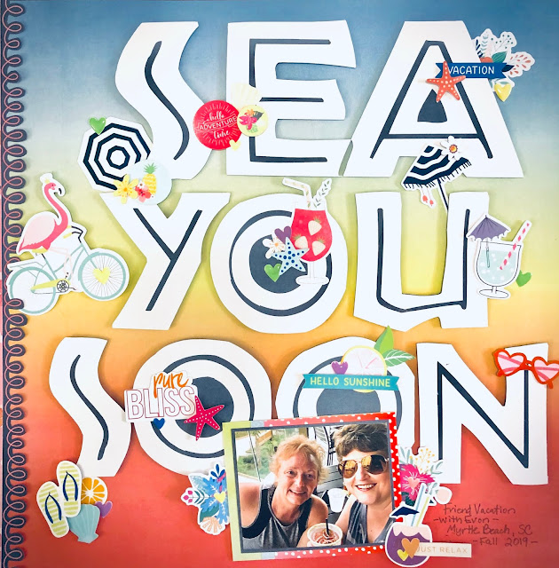
The Myrtle Beach layout has an additional hidden pocket of journaling behind the top picture, held together by the silver clip.
This layout also had hidden journaling in a pocket in the yellow roof section (the red pull tab). I had to sew the top alphas because they were not sticking very well and it seemed easier than gluing each one down.
These next few layouts were made for Memory Bound Scrapbook store using the 49 and Market paper line.
...and cards too
 Again, the layout below has a hidden pocket with some journaling that can be pulled from the top of the layout.

The next few images are of the same layout. The first is how it looks like in a page protector; however, the pink pull tab on the right photo pulls out to reveal a few more photos of and some additional journaling. Again, the layout below has a hidden pocket with some journaling that can be pulled from the top of the layout.


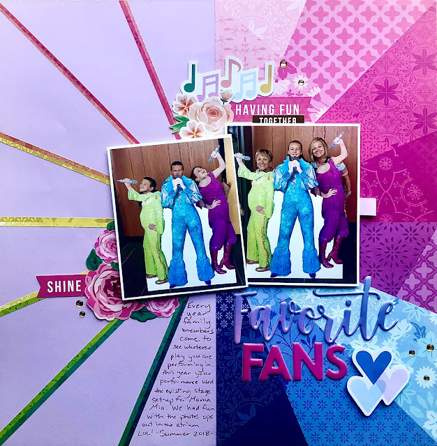
This is the layout of the show that Hope's favorite fans (see above) came to see.

 The layout below is using a cut file and then I just backed each of the stars in coordinating papers.
I started looking at some of my papers in a different way. The wavy lines were cut from a very BOLD pattern paper that I would not have used as is, but by fussy cutting those wavy lines made a great embellishment.

This layout was a near identical scrap lift of a layout I saw on Pinterest and wanted to recreate it. Behind the photo is a tag with hidden journaling...see below.

This layout was a near identical scrap lift of a layout I saw on Pinterest and wanted to recreate it. Behind the photo is a tag with hidden journaling...see below.


This is a mixed media layout, that has a peach/orange color that peaks out behind the main design. I used a striped pattern paper and cut up each strip on the paper at different lengths, distressed the edges and stitched them to the background paper over the mixed media. I then added coordinating stickers and die cuts to finish off the layout.

This layout has a TON of fussy cut elements from multiple pattern papers...the white houses, the colored trees and the tiny bunny and squirrel.
 This layout was a great way to show all the balloons and pictures of us and still use a fairly large cut file of a hot air balloon and clouds. I added stitches between each photo grid to add texture.
This is another background that LOOKS like I did a bunch of mixed media, but it was a pattern paper that came that way. Super easy. The rosette's were made in several different sizes and added different items in the middle to embellish. This is a VERY dimensional layout, but it works fine in a page protector in a D-ring album.
I think this was my VERY first attempt at using mixed media on a layout background and I added stitching to each circle as well. This layout was based on a layout I found on Pinterest, but I used different papers and altered it to work with the size of photo I had to use.

This also looks like a mixed media background, but this was a pattern paper as well. This is also a near identical scrap lift of a layout I saw on Pinterest.
 See that & in my title below...that was actually a dark grey. This was my first attempt at altering the color of an alphabet/embellishment. It was like a puffy alphabet, so I covered the letter with a few layers of gesso, let it dry in between each layer. Then I used 2 different colors of markers to color it in a coordinating color of my layout/title. It turned out ok if you don't look to close, but it works for me.
 See that & in my title below...that was actually a dark grey. This was my first attempt at altering the color of an alphabet/embellishment. It was like a puffy alphabet, so I covered the letter with a few layers of gesso, let it dry in between each layer. Then I used 2 different colors of markers to color it in a coordinating color of my layout/title. It turned out ok if you don't look to close, but it works for me.
This was another near identical scrap lift of a layout I saw on Pinterest. Loved it and had the papers and some of the same embellishments. This is another example of looking at pattern papers and seeing how you can cut them up to use as embellishments. The stripes were all on a larger striped 12 x 12 paper, as were the rainbows and the flowers were fussy cut from 12 x 12 papers.
 This layout has hidden journalling tag above the A in EAT. This was a cut file and I backed each letter in a different color.
...and this one too! LOL!
 ...uh, and this one too, except I added then fold down corner with the trees peeking out because I thought that part of the layout was too blah.

And here is another example of a pattern paper that looks like I did mixed media. This was a SUPER easy layout. I just added the stitching in matching colors in each section. I didn't have any thread in the blue/purple, so I colored it. I pulled out a long length of while cotton thread and used a spray ink and a paint brush to dye the thread. Then I had to wind it back onto a spool so I could use it in my sewing machine. I was amazed at how easy it was.
And of course this is the hidden journaling in the pocket behind one of the photos.

And this is another mixed media layout. I overdid the blue on the right side by the title, but it is fine. LOL!


